Sharcore Constructions
Sharcore Construction - Logo and Brand Design
DESIGN BRIEF
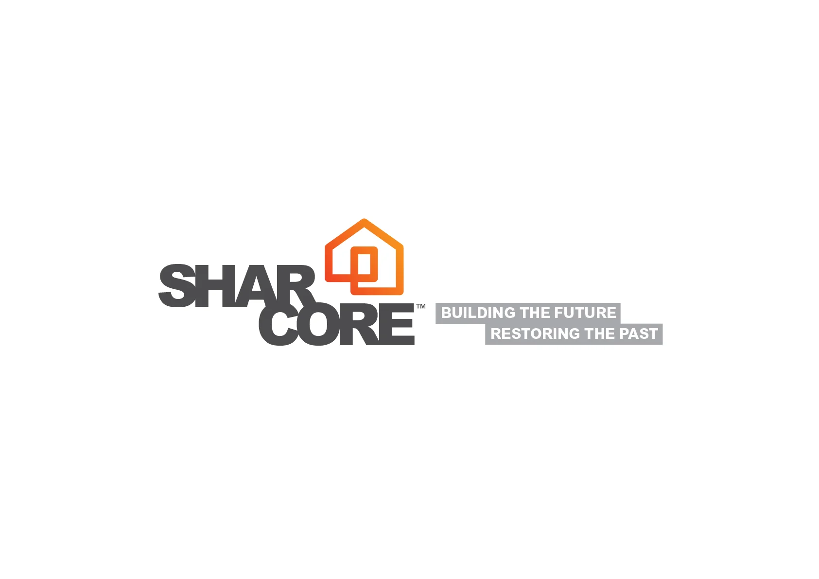
Create an unique brand mark that sets “Sharcore Constructions” apart from their opposition.
New logo design is to be; bold, eye-catching and clearly identifiable from a distance. The design needs to be versatile as vehicle signage must work on both light (White) and dark (Charcoal) coloured vehicles & trailers.
It was suggested to keep existing corporate colours of; Orange, Black/Grey & White although, consideration will be give to other colour options if presented. The design and/or elements of the design need to work as social media icon for consistent branding. EG. Facebook Circular Icon
Consideration to be given to the fact that 'Sharcore' is sometimes referred to as 'Share-Core'.
The Solution
The new, ‘Sharcore Constructions’ logo has been designed to be clean, bold and easily recognisable. Using clean lines and striking colour creates impact. A ‘house’ icon was designed to add a visual element that is easily identifiable. Also splitting the word Sharcore helps readability of the words ‘Shar’ and ‘Core’ hopefully reduce the misinterpretation of ‘Share-care’.
The design is strong, bold and versatile which works well on both light and dark backgrounds.



SHARCORE Website: http://sharcore.com.au/

31 Corio St Shepparton
North Central charm and character!
Properties like this are difficult to find, so if you are looking for a quality home in a great North Central location at the right price then look no further!
North Central Charm and Character!
Properties like this are difficult to find, so if you are looking for a quality home in a great North Central location at the right price then look no further!
This beautifully presented home is rich in character and personality. From the moment you enter the gate, you experience the English inspired cottage garden with hedges, silver birch trees and manicured lawns.


This 1930 circa home maintains many of its period features and has lost none of its original charm with the quality transformation in modern living and comfort.
Warm polished floor boards and high ceiling with ornate ceiling roses are features to the lounge and leads through to modern kitchen with stainless steel dishwasher and 900mm free standing oven. Impressive bathroom with stone bench tops and eye-catching fittings. Two comfortable bedrooms are located at the front of the home, with the third bedroom in the privacy of the back of the home off the sunroom that catches the morning light. Large French doors lead off the dining area and open into the outdoor entertaining area which is covered by a canopy of greenery with views of the private rear yard and garden beds.
Other features include an impressive fully fenced back yard, 7mt x 4mt (approx.) shed with a concrete floor and power, double carport and high front fence and gates keep the children and pets under control.
A sought-after area close to schools, shops and walking distance to the CBD and sporting facilities.
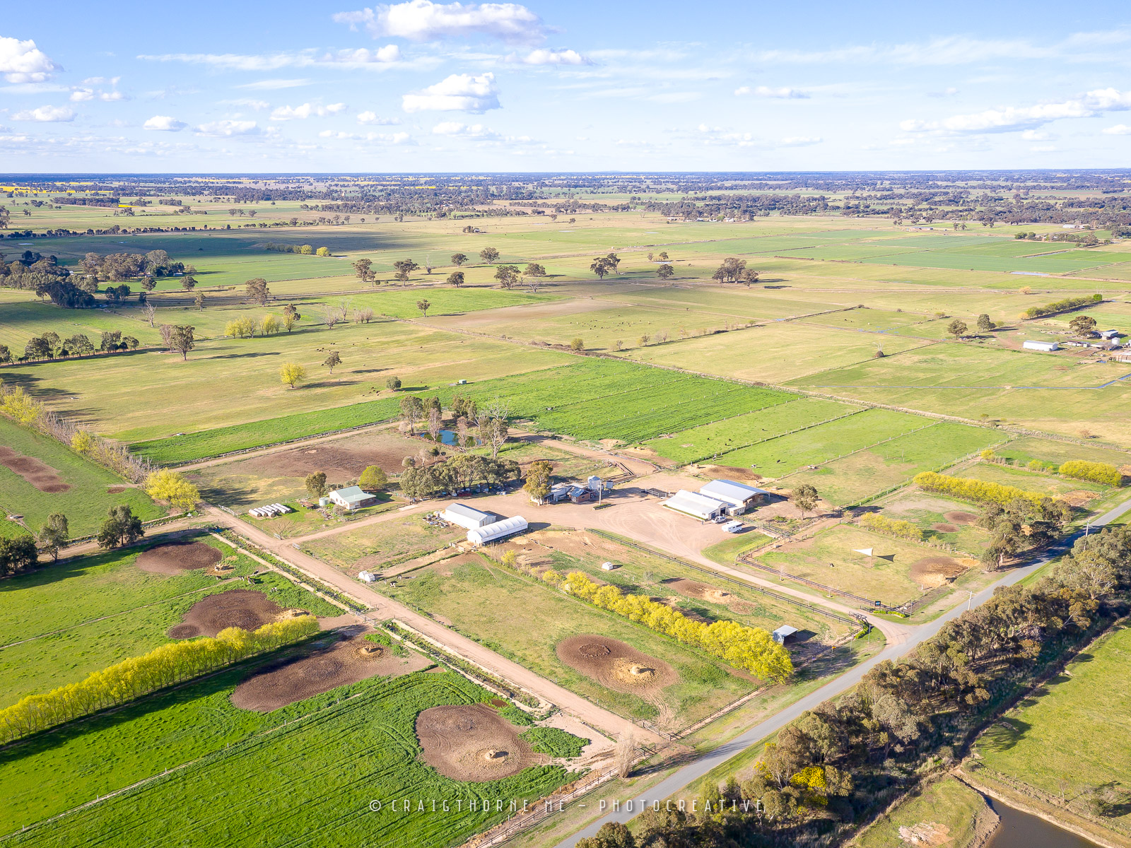
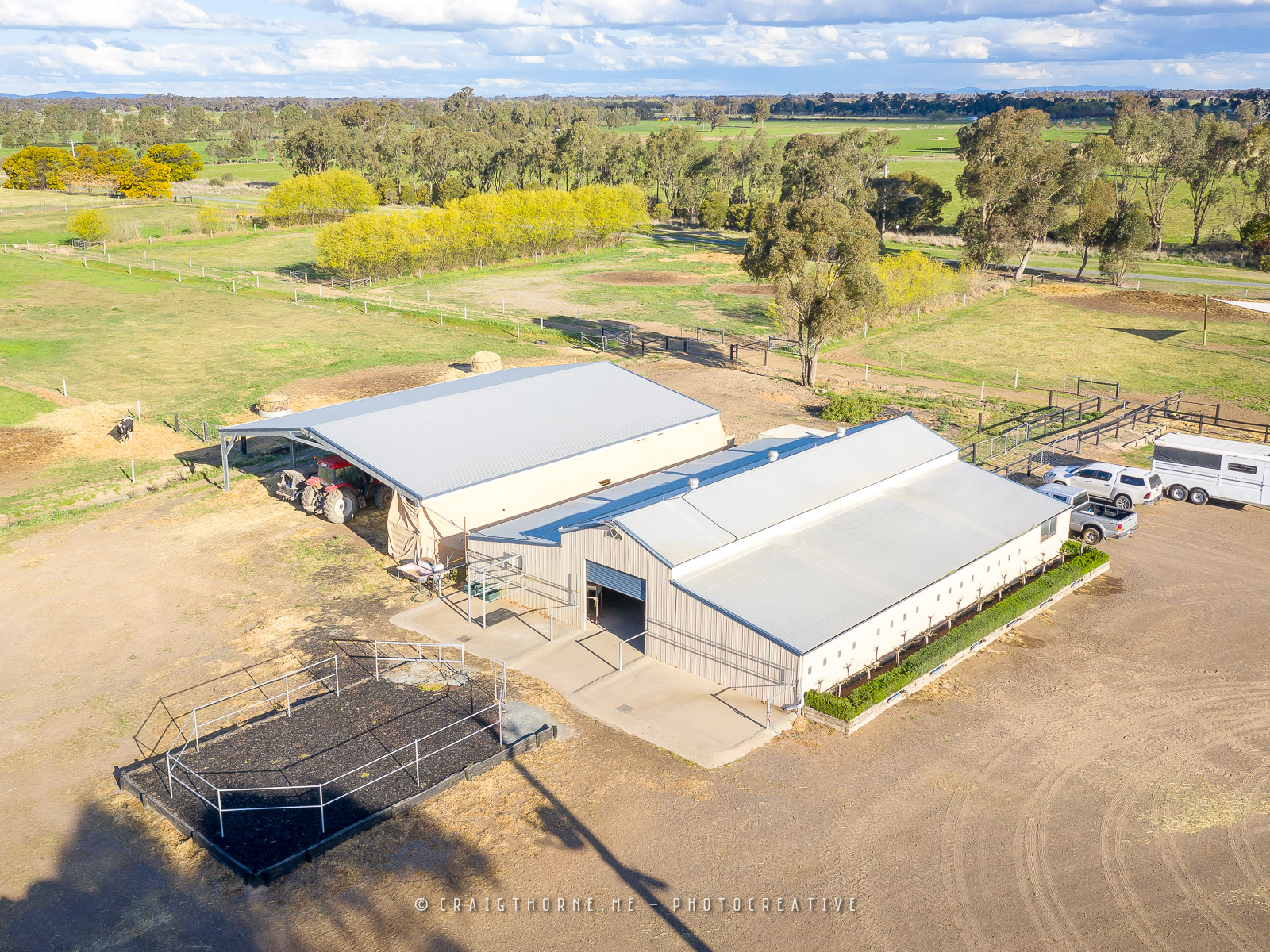
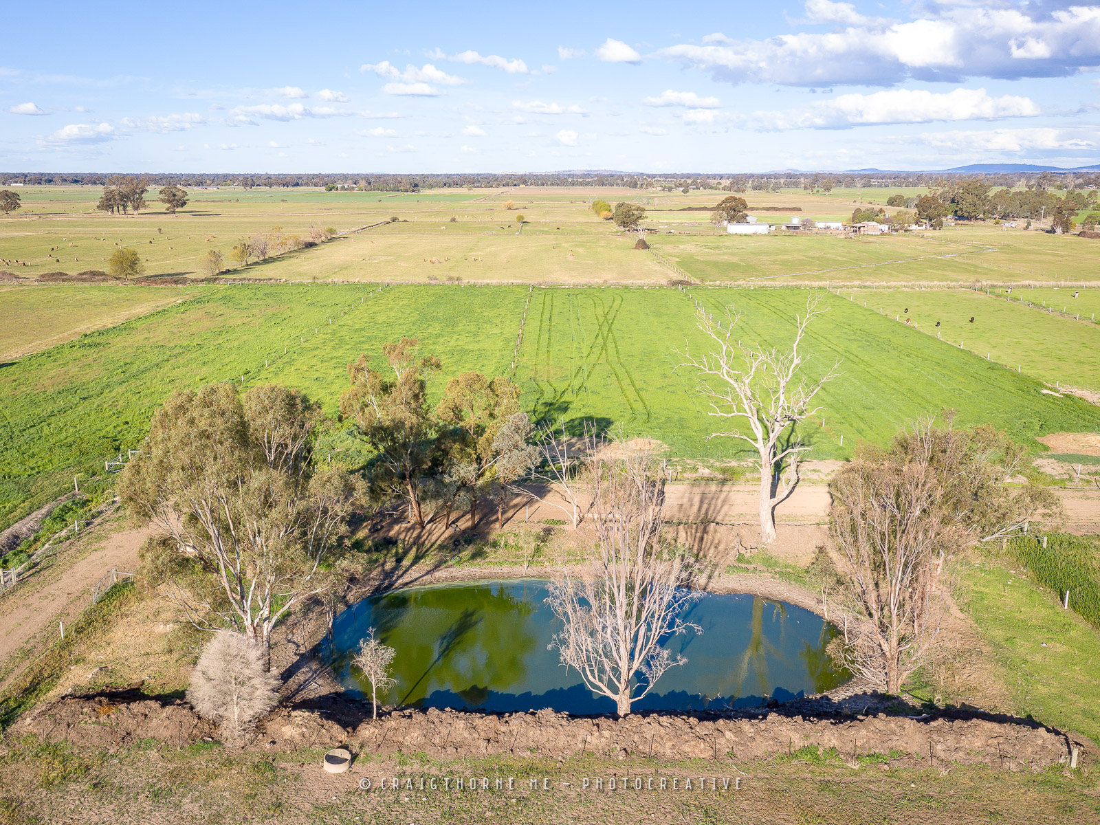
PHOTOGRAPHY BY CRAIG THORNE


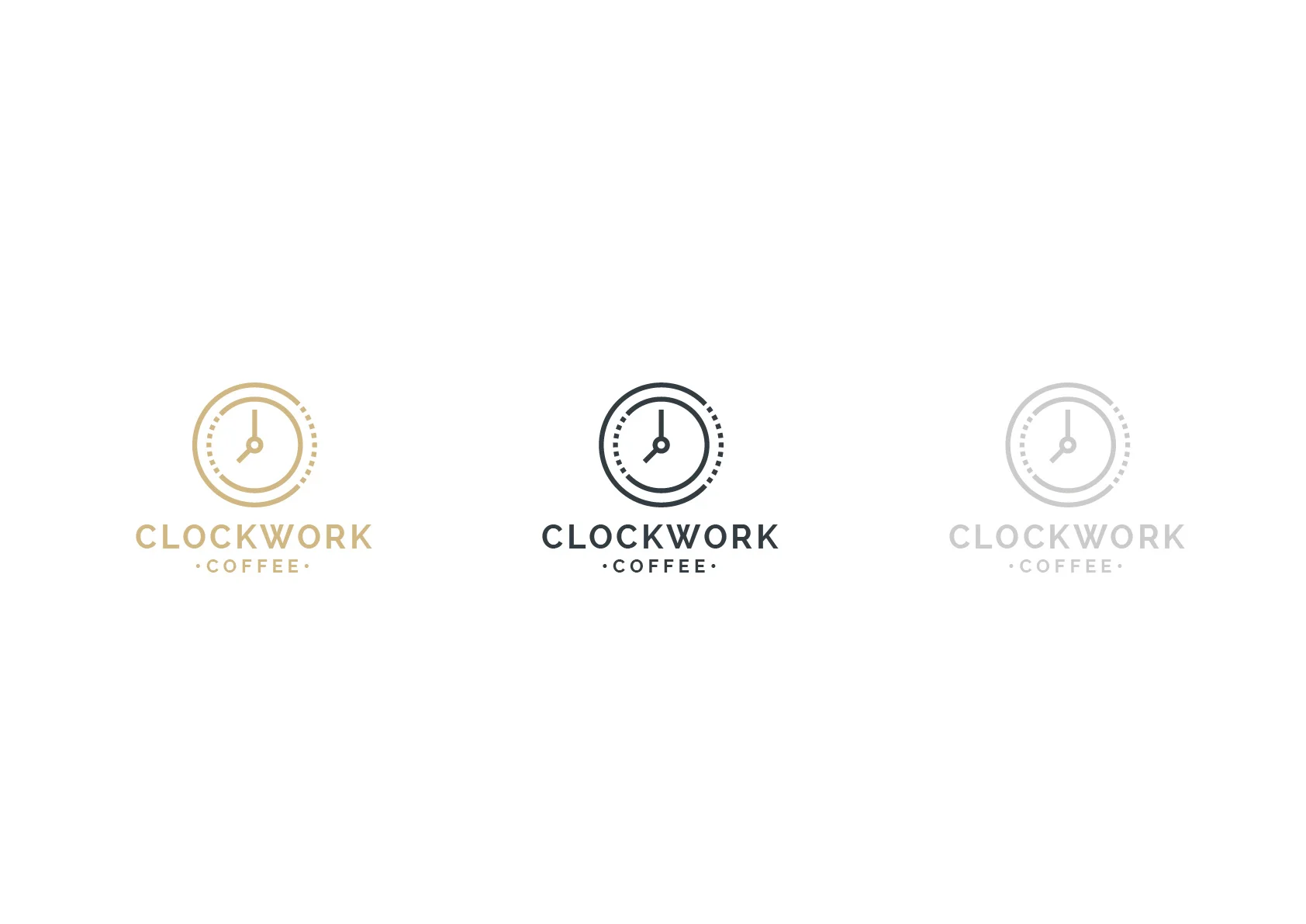
Clockwork Coffee
Clockwork Coffee - Rebrand
Clockwork Coffee Rebrand
– The Brief –
Create an unique brand mark that sets “Clockwork Coffee” apart from their opposition.
The new logo design is to portray a sense of precision. A sense of class and sophistication.
The design needs to be versatile and clearly identifiable when used with light and dark backgrounds. It was important the design and/or elements of the design needs to work on social media for consistent branding.

– THE SOLUTION –
The new Clockwork Coffee logo was designed to be simple using clean lines to form a clock face. Dotted / broken lines have been used to help portray the mechanical ‘workings’ of the clock. i.e. the ‘clockworks’. The design works well at both large and small scale. The clock icon is used on social media networks which helps connect a strong brand awareness.